Active Users
The Active Users page helps you understand how many people interact with Smart Assistant, how often they return, and what channels or devices they use. It provides a clear and comprehensive view of how your audience behaves, allowing you to measure the adoption and Engagement level of your assistant over a selected time period.
By reviewing these metrics, you can identify peaks in user activity, analyze Retention Rate patterns, and understand how well your Smart Assistant supports users throughout their shopping or support journey.
Period selection and filters
At the top of the page, you can select the Time Range you want to analyze. The available options are Last 24 hours, Last week, Last month, Last year, or a Custom range.
You can also use the Filter panel to refine your analysis by the following parameters:
- Source : allows filtering data by device type, such as desktop, tablet, mobile, app, or smart TV.
- Channel : filters data by the communication channel through which users interact with Smart Assistant, such as website, WhatsApp, or Messenger.
- Language : enables analysis by the language detected in conversations.
- Country : focuses the analysis on a specific country or region.
Filters can be combined to explore specific audience segments, such as “mobile users from Spain using WhatsApp.” After choosing your filters, select Apply to update the data on all widgets. You can click Reset at any time to clear the filters and return to the full dataset.

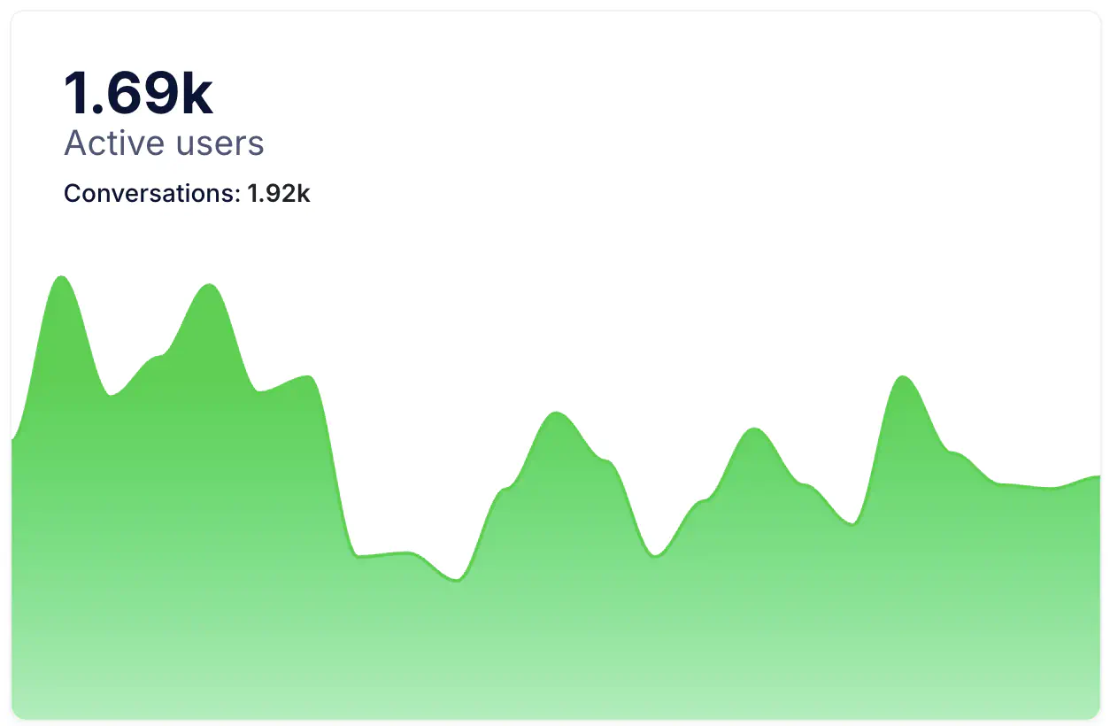
Active Users graph
This graph shows the total number of users who interacted with Smart Assistant during the selected period. It helps you understand the assistant’s overall visibility and reach. Peaks in the graph usually correspond to specific marketing actions, product launches, or website traffic increases, while more stable periods represent consistent engagement.
If the line grows or remains steady over time, it reflects healthy adoption and good visibility of the assistant within your digital ecosystem.
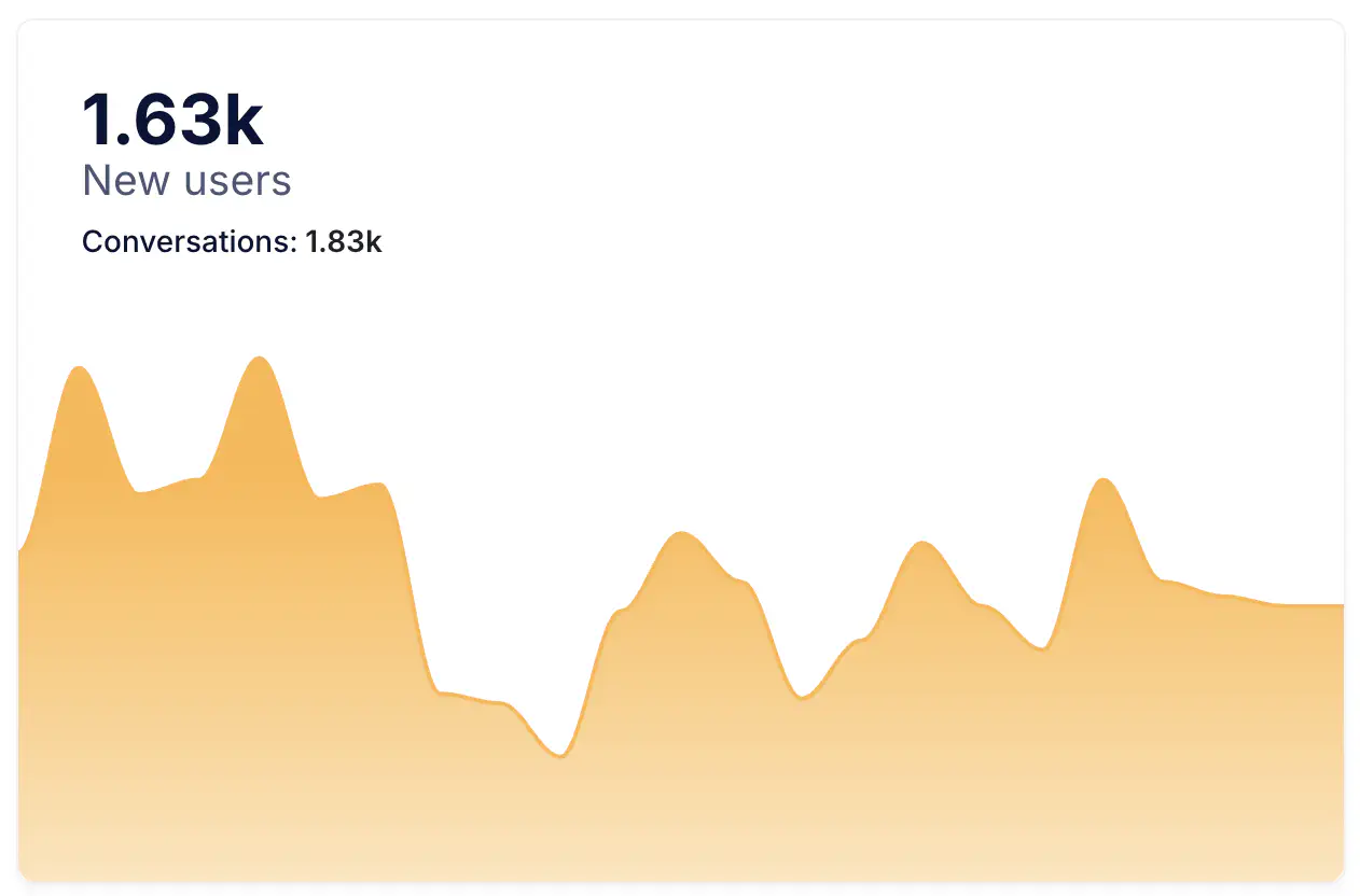
New Users graph
This graph focuses on New Users who interacted with Smart Assistant for the first time during the selected period. It provides insight into how effectively your assistant attracts new visitors, which is especially important when evaluating campaign performance or the assistant’s visibility on your website or app.
A consistent number of new users indicates a steady acquisition rate and that visitors are finding the assistant easily. Drops in new users may point to lower site traffic, reduced visibility of the chat entry point, or seasonal factors.
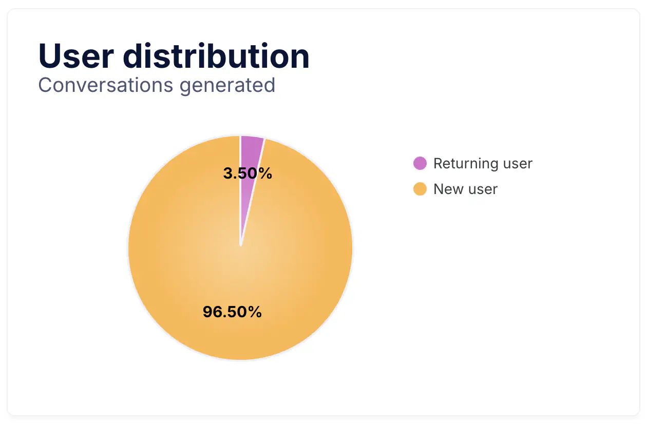
User Distribution pie chart
The User Distribution chart compares the proportion of new versus Returning Users , giving a quick overview of engagement and loyalty. If most users are new, it means your assistant is still in an early growth phase and reaching fresh audiences. When returning users increase, it signals that customers are finding genuine value in the assistant and are coming back to interact again.
A healthy balance between both groups reflects strong acquisition and good retention, two essential components for long-term performance.
Daily Active Users
This metric represents the average number of users who interacted with Smart Assistant each day within the selected date range. It helps you measure daily engagement consistency. A stable or growing trend means the assistant is part of your users’ regular experience and is successfully supporting ongoing interactions.
Daily New Users
This value shows how many new users, on average, interacted with Smart Assistant per day. Tracking this number helps you evaluate your assistant’s ability to attract new visitors and identify the effectiveness of your acquisition strategies. A high or rising value indicates strong visibility, while sudden decreases might suggest fewer entry opportunities or changes in site traffic.
Daily Returning Users
This indicator measures the number of returning users who came back to interact again after their first conversation. It is one of the clearest signs of retention and long-term value. When this number grows, it shows that Smart Assistant continues to meet users’ needs and remains relevant over time. This metric is especially useful to evaluate the assistant’s usefulness for post-purchase questions, customer support, or recurring guidance.
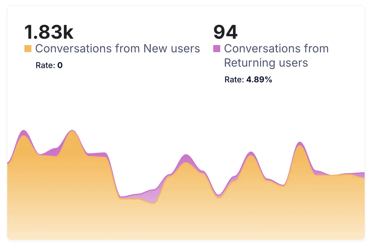
Conversation Breakdown
This section shows how many Conversations are generated by new users versus returning users. It helps you understand where engagement is coming from and how conversation patterns evolve. When returning users account for a larger share, it reflects loyalty and satisfaction, as those users come back repeatedly for assistance.
Conversely, a predominance of new user conversations may indicate that more people are discovering the assistant for the first time. Reviewing both groups together provides a complete picture of how the assistant engages audiences over time.
Daily Conversations
This metric displays the average number of Conversations handled per day. It provides a view of how active your assistant is and how user demand evolves. Increases usually occur during marketing campaigns, product launches, or high-traffic periods, and help you anticipate support needs or workload peaks.
Monitoring this data ensures your assistant maintains the right response capacity to handle user demand effectively.
Conversations per New Users
This indicator shows how many conversations, on average, each new user initiates during the selected period. It reflects how engaging the assistant is for first-time visitors. A higher average suggests that users are interacting naturally, asking multiple questions, or exploring products during their first contact.
If the number is low, it might be worth revising the welcome message or entry prompts to encourage more interaction at the first touchpoint.
Conversations per Returning Users
This metric represents how many conversations returning users typically initiate. It’s an important measure of Engagement and customer loyalty. Users who start several conversations over time often rely on Smart Assistant as a regular source of help or advice.
Tracking this data helps you understand how frequently users come back for additional support and whether your assistant is perceived as a trusted point of contact.
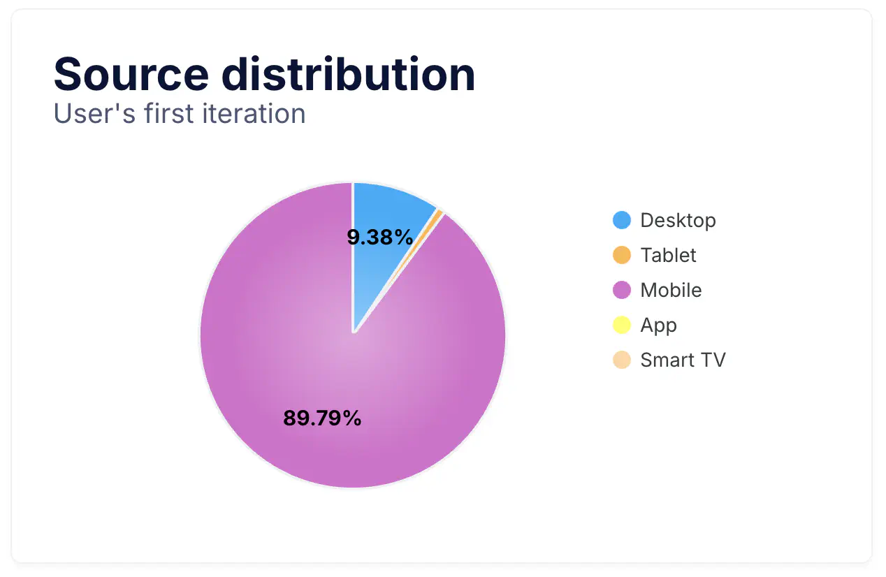
Source Distribution pie chart
The Source Distribution chart shows the devices or environments users use to access Smart Assistant, such as desktop, tablet, mobile, app, or smart TV. This information helps you understand how people connect with the assistant and adapt your interface and messaging accordingly.
For example, a strong mobile share may indicate that many conversations begin on smartphones, highlighting the importance of optimizing for smaller screens and fast interactions.
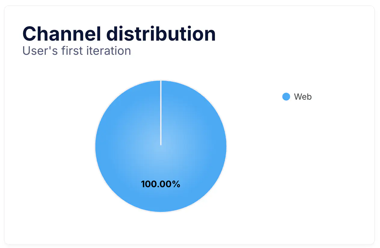
Channel Distribution pie chart
This graph indicates the Channel through which users first interact with Smart Assistant, such as web, WhatsApp, or Messenger. It helps you identify which channels generate the most engagement and where to focus your communication efforts.
A high percentage of web interactions shows that the assistant is performing well within your eCommerce experience, while a higher share of messaging channels points to effective omnichannel strategies and conversational commerce potential.
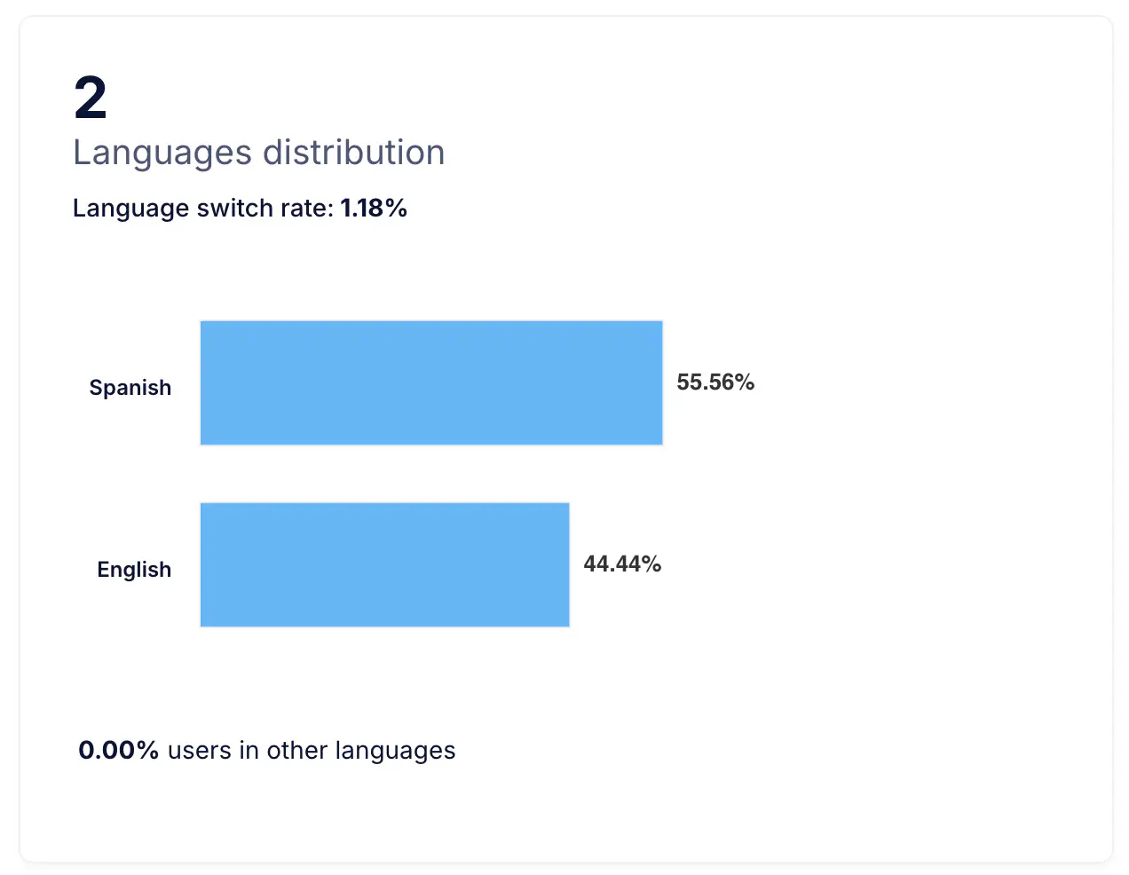
Language Distribution bar chart
This chart displays the Language Distribution detected in conversations, giving you an overview of how users communicate with the assistant. It is particularly useful for brands operating in multiple markets or multilingual contexts, as it helps plan localized content, scripts, or assistant configurations.
Tracking language usage over time can also reveal new emerging audiences or regions where users are beginning to engage more frequently.
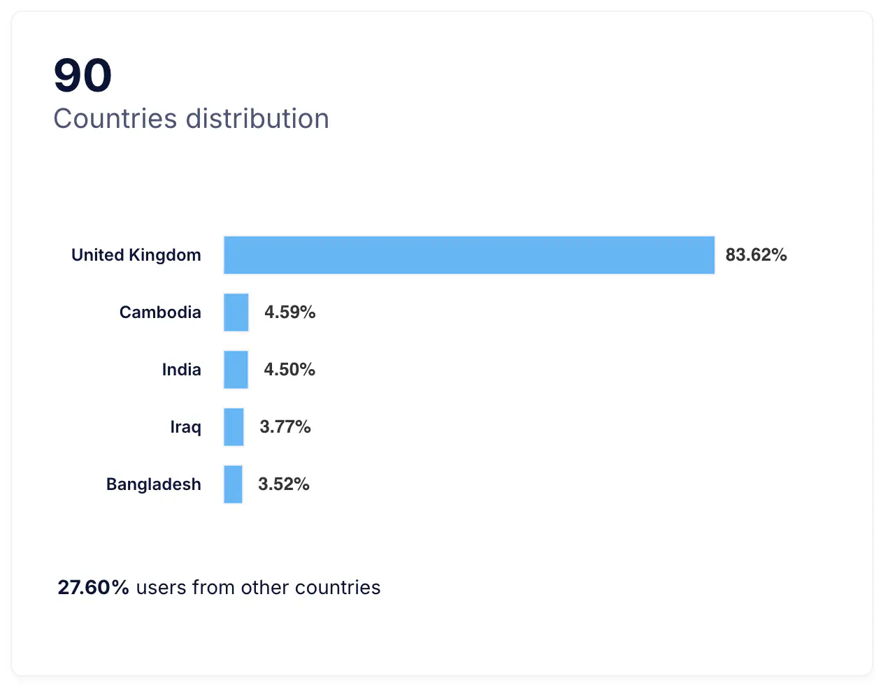
Country Distribution bar chart
This graph shows the Country Distribution of users by country. It provides a clear understanding of where your Smart Assistant is most active and helps identify regional patterns in user engagement. For international businesses, this data supports decision-making on localization, marketing focus, and customer support strategies across markets.
Notes and Recommendations
- Use the date filter at the top of the page to focus on specific campaigns, product launches, or seasonal trends.
- Compare variations in activity with marketing actions or traffic changes to understand their impact on engagement.
- Combine insights from this page with Conversion Rate and Engagement analytics for a complete performance overview of your Smart Assistant.