Conversations KPIs
The Conversations page provides an overview of how users interact with Smart Assistant, showing the total conversation volume, flow, and engagement results over time. It helps you understand when users are most active, how conversations evolve, and how effectively the assistant manages interactions.
By reviewing these metrics, marketing and operations teams can measure user engagement, evaluate support performance, and identify optimization opportunities across campaigns or product cycles.
Period selection and filters
At the top of the page, you can select the Time Range you want to analyze. The available options are Last 24 hours, Last week, Last month, Last year, or a Custom range.
You can also use the Filter panel to refine your analysis by the following parameters:
- Source : allows filtering data by device type, such as desktop, tablet, mobile, app, or smart TV.
- Channel : filters data by the communication channel through which users interact with Smart Assistant, such as website, WhatsApp, or Messenger.
- Language : enables analysis by the language detected in conversations.
- Country : focuses the analysis on a specific country or region.
Filters can be combined to explore specific audience segments, such as “mobile users from Spain using WhatsApp.” After choosing your filters, select Apply to update the data on all widgets. You can click Reset at any time to clear the filters and return to the full dataset.

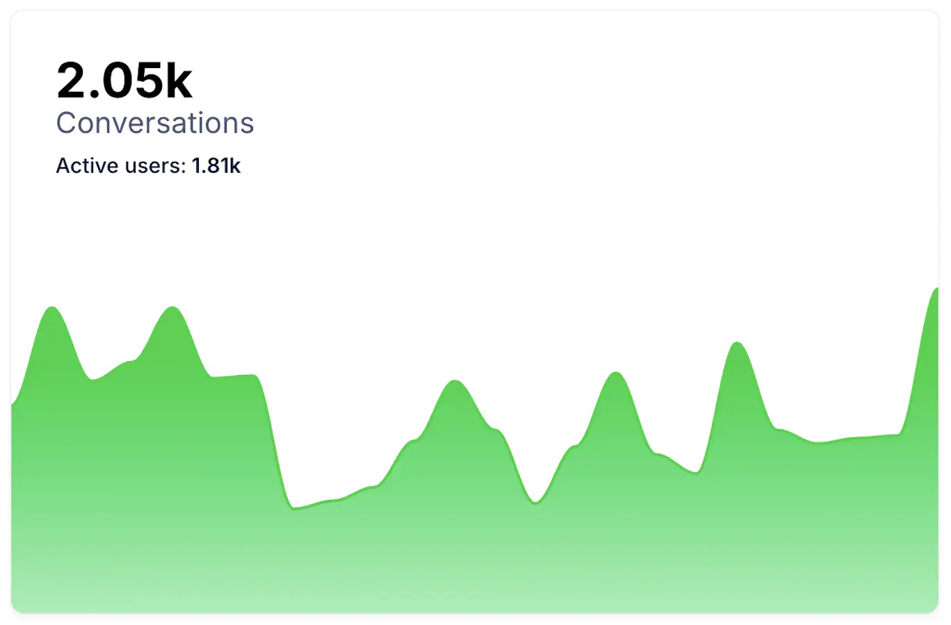
Conversations graph
Displays the total number of Conversations handled by Smart Assistant during the selected period and number of Activer users Each conversation represents a complete exchange between a user and the assistant, from the first message to the end of the interaction.
This data shows the assistant’s overall activity level. Increases in the graph often align with promotional campaigns, product launches, or sales periods. Stable volumes indicate consistent user engagement and operational performance.
Daily Conversations
Displays the average number of conversations per day for the selected range. This helps you understand the day-to-day rhythm of demand and anticipate staffing or automation capacity during busy periods.
Average Duration
Shows how long conversations last on average. Longer durations can indicate complex questions or exploratory shopping journeys. Shorter durations can reflect quick resolutions or transactional use cases. Track this value together with escalation and satisfaction to confirm whether longer sessions are positive exploration or friction.
Average Messages per Conversation
Shows the mean number of messages exchanged in each interaction. A higher value suggests active dialogue and deeper guidance. A lower value can indicate fast resolution or short, one-question sessions. Aim for a balance that reflects helpful guidance without unnecessary back-and-forth.
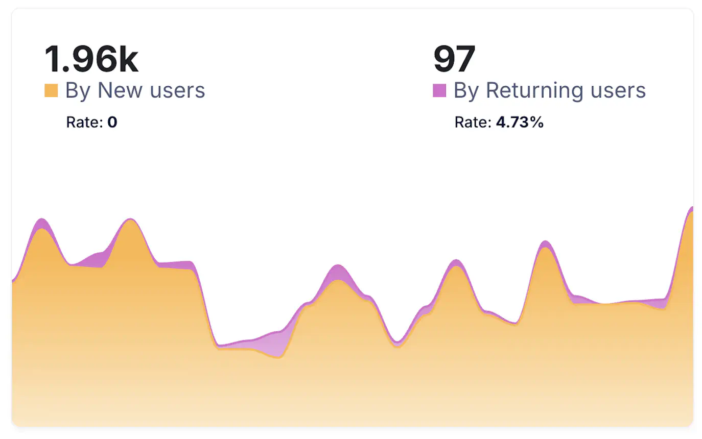
Conversations by user type (New vs Returning)
Compares conversations generated by New Users versus Returning Users . If returning users drive a growing share, the assistant is becoming a habitual touchpoint. If most conversations come from new users, review visibility and onboarding flows to convert first-time interactions into repeat usage.
Daily Active Users
Shows the average number of Daily Active Users who interacted with the assistant in the selected period. Use it together with Daily Conversations to check intensity per user. If conversations grow faster than active users, each person is asking more questions or returning more often.
Conversations per New User
Shows the average number of conversations initiated by each New Users profile during the selected period. A higher value means first-time visitors find the assistant useful and keep asking follow-up questions. If the value is low, review the welcome message and early prompts to encourage the first interaction.
Conversations per Returning User
Shows the average number of conversations started by Returning Users . Growth here signals loyalty and habitual use. If it drops while daily active users stay stable, users might be getting answers faster or shifting to other channels.
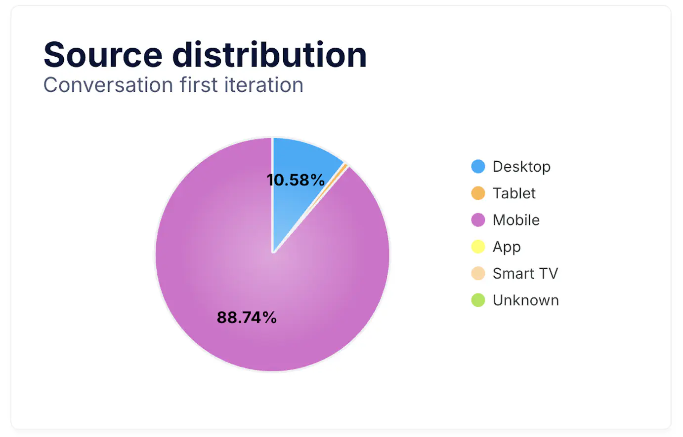
Source Distribution pie chart
The Source Distribution chart shows which devices users use when starting a conversation with Smart Assistant, such as desktop, tablet, mobile, app, or smart TV. It helps you understand where conversations originate and whether your entry points are well positioned on each device.
A strong mobile share suggests that many conversations begin on smartphones, so prioritize short prompts, quick replies, and compact UI. If desktop dominates, review longer guidance and richer content blocks.
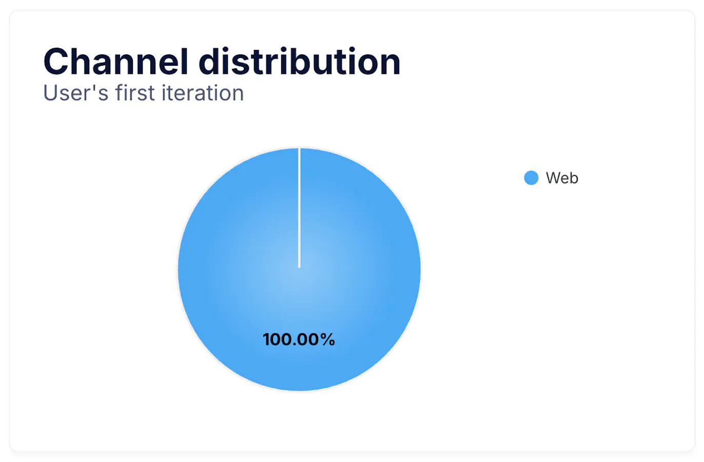
Channel Distribution pie chart
This chart displays conversations by Channel , for example web, WhatsApp, or Messenger. Use it to identify the channels that generate more interactions and where to focus content and promotions.
If web leads, place the assistant prominently on key pages such as product detail and checkout. If messaging apps grow, reinforce proactive messages and service workflows designed for chat-first journeys.
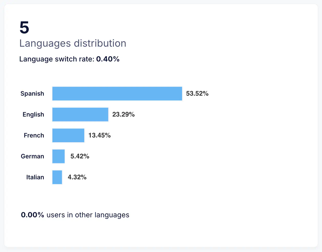
Language Distribution bar chart
The Language Distribution chart shows the languages detected in conversations. It helps plan localized scripts, tone, and content, and confirms whether the assistant covers your active markets.
Increasing usage in a new language is a good signal to extend training data, FAQs, and product copy for that audience.
Country Distribution bar chart
The Country Distribution chart breaks down where conversations are happening. Use it to track adoption by market, compare regions, and align campaigns or support hours.
Growth in a specific country can guide where to launch new channels, add local payment or delivery answers, and prioritize language coverage.

Conversation Start Time heatmap
The Conversation Start Time heatmap shows when users begin conversations with Smart Assistant throughout the day and week. It highlights traffic peaks and quiet hours, helping you align proactive messages, staffing, and campaign timing with real user behavior.
For instance, if you see high activity around midday or late evening, those may be the best times for proactive engagement or chatbot triggers. A steady distribution throughout the day indicates constant use and broad availability of the assistant.

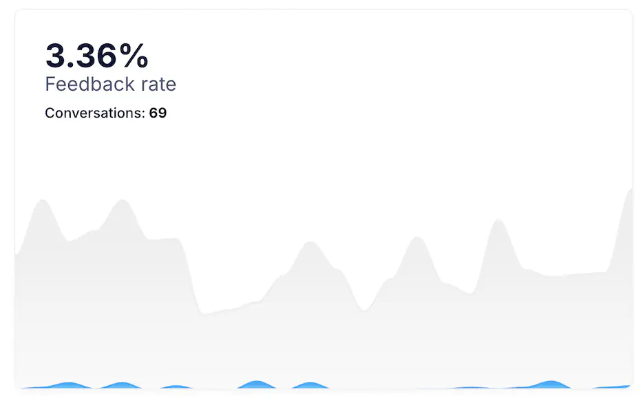
Feedback Rate
The Feedback Rate shows the percentage of total conversations where users submitted a rating or comment. It helps evaluate how engaged users are in providing feedback and how visible your feedback request is.
A high rate indicates that users feel involved in sharing their opinions, while a low rate may suggest that the rating prompt appears too late or is not clearly visible. Aim to maintain regular feedback collection to continuously improve your assistant’s tone, accuracy, and flow.
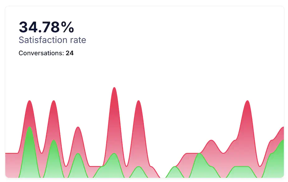
Satisfaction Rate
The Satisfaction Rate measures the percentage of conversations rated positively by users. It reflects overall quality and user trust in Smart Assistant’s responses and guidance.
Analyze satisfaction together with escalation and duration metrics. A high satisfaction rate alongside shorter sessions typically means quick, accurate answers. If satisfaction drops while durations rise, users may be struggling to find solutions.
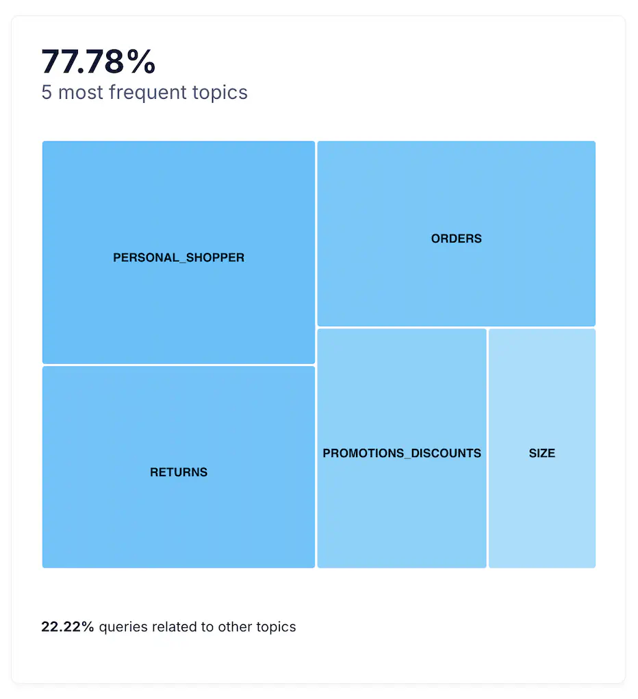
Top 5 Most Frequent Topics
This section lists the five Topics most frequently discussed in conversations. Each topic represents a main category of questions or intents (for example, Delivery, Returns, Product Information, Promotions, or Size Advice).
Tracking the most popular topics helps identify where user interest is concentrated and where improvements in content or automation can have the greatest impact. Consistent top topics reveal your main contact drivers, while sudden changes can reflect new marketing actions or seasonal needs.
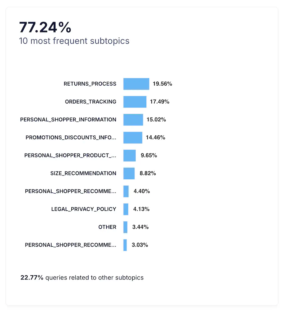
Top 10 Most Frequent Subtopics
The Subtopics chart provides deeper insight into the top ten detailed themes within each main topic. Subtopics represent more specific intents such as Track my order, Return policy, Size exchange, or Delivery options.
Monitoring subtopics helps prioritize which flows or answers to refine. If one subtopic grows disproportionately, it may indicate user confusion, missing content, or a process that could be simplified. Together with satisfaction and feedback data, it’s one of the best indicators of how well your assistant handles real customer needs.
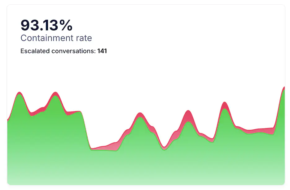
Containment Rate
The Containment Rate measures the percentage of conversations successfully handled by Smart Assistant without needing human intervention. A high containment rate means the assistant resolves most user inquiries independently, improving efficiency and reducing support workload.
Monitor this value alongside Escalation Rate and Satisfaction Rate . If containment is high and satisfaction remains positive, automation is performing effectively. A drop in containment or an increase in escalations may indicate unclear answers or gaps in the assistant’s content.
Daily Escalated Conversations
This metric shows the daily number of Conversations transferred from Smart Assistant to a human agent. It provides visibility into when escalations happen most often, helping teams balance staffing and improve handoff processes.
Spikes may correspond to new campaigns, product issues, or sudden traffic peaks. Tracking this metric over time helps ensure escalation capacity matches demand.
Automated Escalation Rate
The Automated Escalation Rate shows the proportion of conversations automatically transferred to a human agent by predefined logic, such as a detected intent or keyword. This ensures that users quickly reach support when the assistant identifies complex or high-priority requests.
A higher automated rate can be positive when designed intentionally for sensitive topics, but if it rises unexpectedly, review automation triggers to avoid unnecessary transfers.
Requested Escalation Rate
The Requested Escalation Rate indicates the percentage of conversations in which the user explicitly asked to speak with a human. It reflects user trust and satisfaction: frequent requests may suggest frustration or that the assistant could not provide a clear answer.
If this rate increases, analyze conversation transcripts or feedback to detect patterns and improve the assistant’s coverage of those questions.
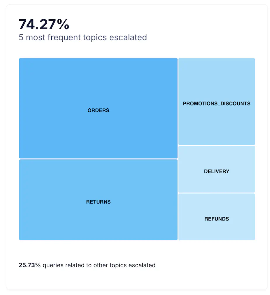
Top 5 Most Frequent Topics Escalated
This section highlights the five Topics that most frequently lead to human escalation. Typical examples include Payment issues, Order tracking, or Return authorizations.
Reviewing these topics helps identify where automation could be reinforced or where human assistance is essential for a quality user experience. Reducing escalation in repetitive topics frees up human agents for complex or high-value interactions.
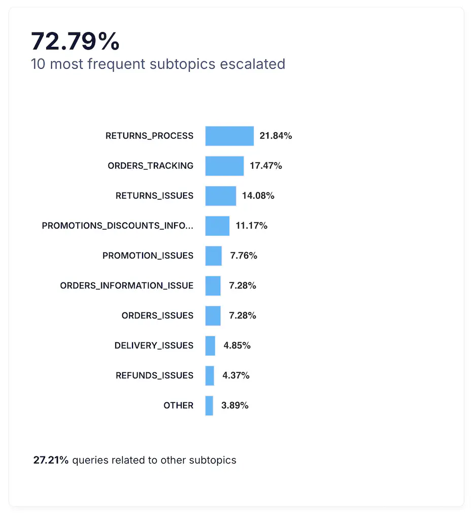
Top 10 Most Frequent Subtopics Escalated
This chart lists the ten Subtopics most often escalated to human support. These represent the specific issues where the assistant needs further improvement or additional training data.
Analyzing these subtopics reveals where conversation flows might be incomplete or where users require reassurance from a human. Use this insight to enhance automation coverage while preserving a smooth, helpful escalation path.
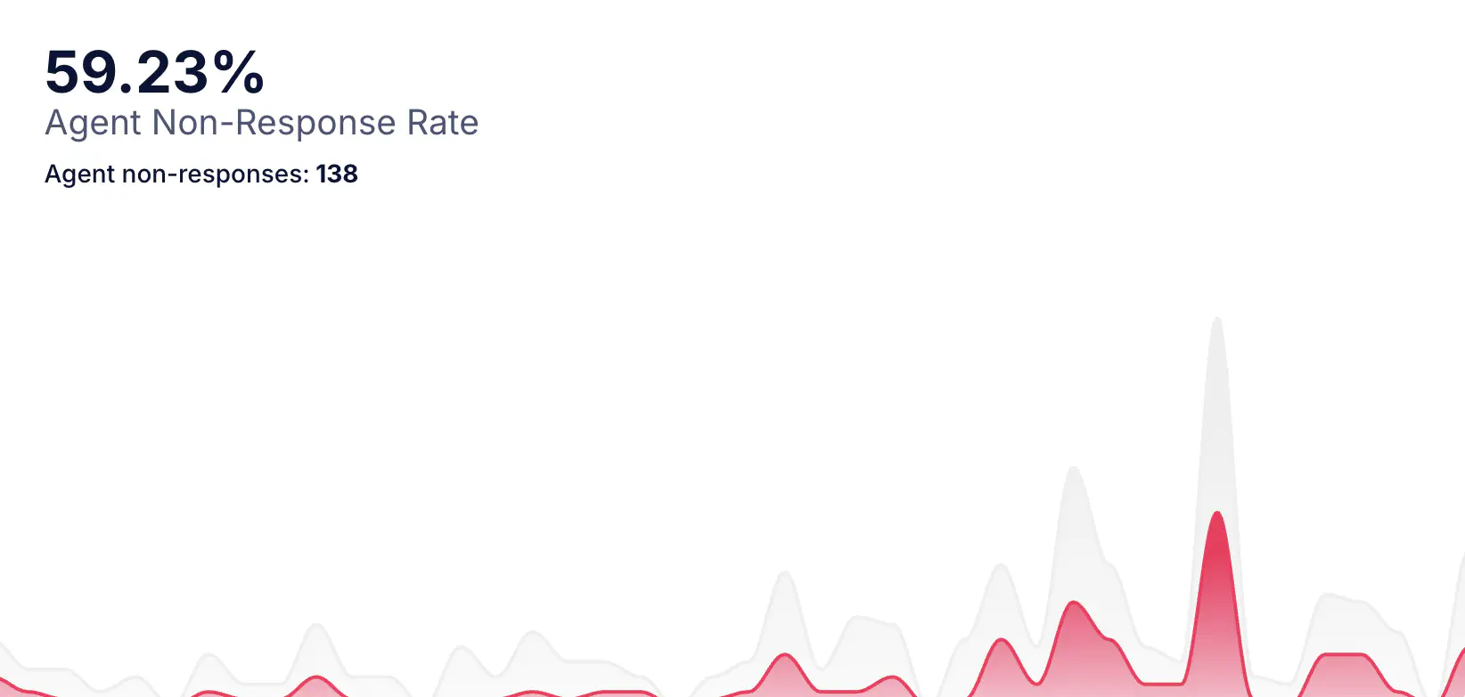
Agent Non-Response Rate
This chart shows the percentage of escalated conversations in which a human agent did not provide a response after the handover. It helps assess agent availability, operational capacity, and potential gaps in human support processes.
A high value suggests that users are being transferred to human support but not receiving assistance, which can negatively impact satisfaction and resolution metrics.
Escalated conversations (Chat)
The total number of user conversations that were escalated specifically to the chat channel during the selected period.
Daily Escalations (Non-response)
The average number of daily escalations resulting in non-response. This helps quantify the recurring operational gap across days.
Chat Escalation Rate (vs. Ticket)
Indicates the proportion of escalations handled via chat compared to ticket-based workflows. A higher chat escalation rate suggests users prefer real-time support, or that automation is routing issues toward live agents instead of asynchronous ticketing.
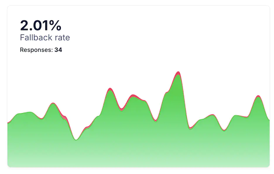
Fallback Rate
The Fallback Rate measures the percentage of messages where the assistant could not understand or match the user’s intent. It is a key signal of conversational accuracy. A high fallback rate suggests missing content or insufficient training in certain languages or phrasing.
Monitor fallback trends by channel or topic to detect where improvements are needed. Frequent fallbacks in a specific product category, for example, may indicate a need for more specific FAQs or data coverage.
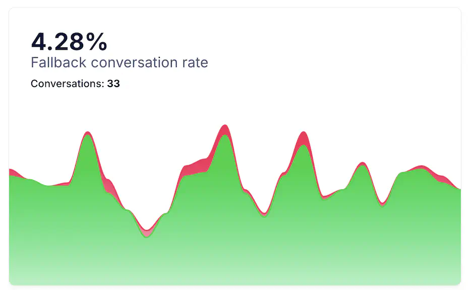
Fallback Conversation Rate
The Fallback Conversation Rate shows the percentage of total conversations that experienced at least one fallback moment. While occasional fallbacks are natural, a high conversation-level rate can harm user experience.
In eCommerce contexts, typical Fallback Conversation Rates range from 10% to 30%. Lower values indicate that the bot is successfully understanding user intents, while higher rates often suggest gaps in training data, ambiguous flows, or a high volume of free-text queries. Mature automation setups usually aim to keep this metric below 20%.
Analyze fallback conversations together with Satisfaction Rate and Escalation Rate to measure the impact on user satisfaction and automation quality. Reducing this metric should be a key objective for continuous improvement.
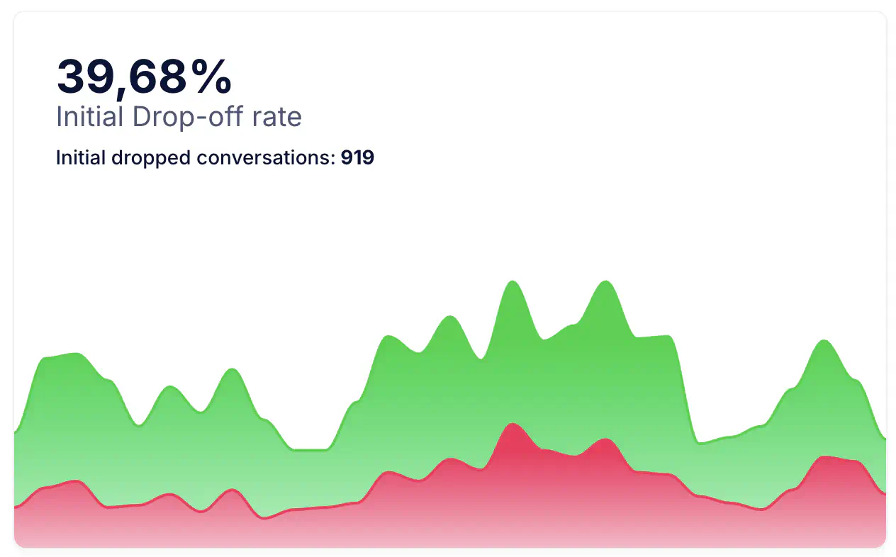
Initial Drop-off Rate
The Initial Drop-off Conversation Rate shows the percentage of total conversations in which users abandon the interaction immediately after the greeting or first bot message, without meaningfully engaging (for example, not selecting an option or not sending a follow-up message). A high initial drop-off rate usually signals issues with the welcome message, lack of clarity in the first options, low perceived value, or slow response times.
In eCommerce benchmarks, Initial Drop-off Rates typically range between 25% and 55%, depending on the quality of the greeting, channel type (webchat usually higher, messaging apps lower), and the availability of clear next steps. Well-optimized retail chatbots often achieve rates below 30%, while poorly configured experiences can exceed 50%.
Analyze Initial Drop-off Conversation Rate together with Satisfaction Rate and Escalation Rate to measure the impact on user satisfaction and automation quality. Reducing this metric should be a key objective for continuous improvement.
Notes and Recommendations
- Use the time range and filters at the top to focus on specific periods, campaigns, or events that may influence conversation volume or satisfaction.
- Look for patterns between Containment Rate, Escalation Rate, and Satisfaction Rate to evaluate automation performance and the quality of user experience.
- Monitor Fallback Rate and Fallback Conversation Rate to identify potential content gaps or intents that users frequently express in unexpected ways.
- Pay attention to the Conversation Start Time heatmap to detect daily or weekly peaks in user activity and align engagement actions or agent availability accordingly.
- Review the most frequent Topics and Subtopics (especially escalated ones) to understand recurring user needs and prioritize areas where automation can improve.
- Combine insights from this page with Active Users and Engagement analytics to gain a complete view of user behavior, conversation quality, and overall assistant effectiveness.