Integration for Android
The following describes the necessary steps to integrate Size Adviser into an Android application.
Resources
- App Identifier - Provide us your app id.
- Documentation - All information for adding Size Adviser to your App.
- Sample usage - Review how to use
- Visual customization - Check visual customization options
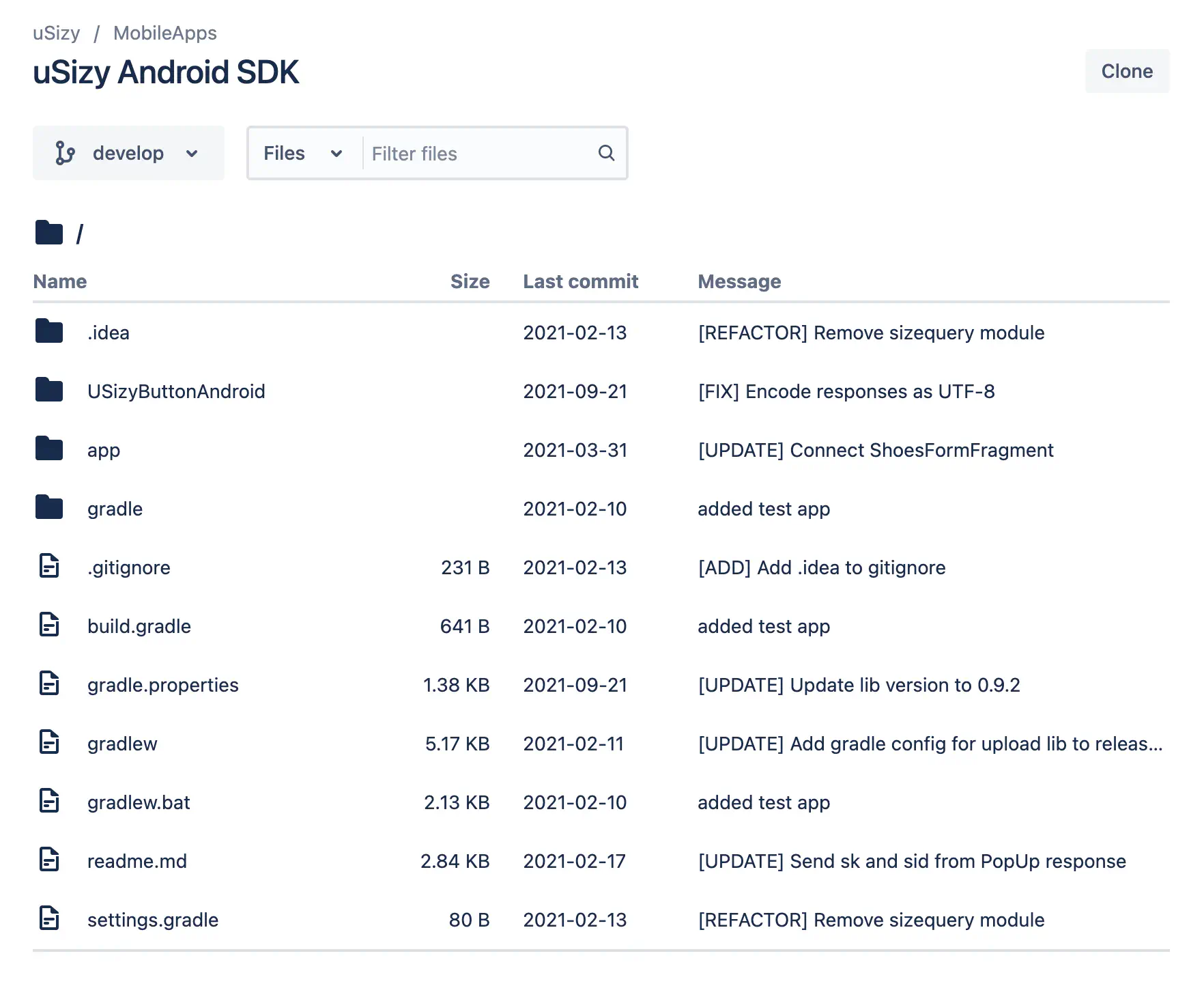
- Sample App - Download a sample app
- Our respository - Clone it and integrate it.
App identifier
In order to enable your app integration you must provide us with your APP identifier, you can check it in the following link https://developer.android.com/build/configure-app-module#set-application-id
Android Studio Setup
Gradle
Open Gradle Scripts | build.gradle (Project: <your_project> and do the following:
- Add the following to the buildscript { repositories {}} section of the build.gradle (Project) file:
allprojects {
    repositories {
        maven {
            url "https://bitbucket.org/usizy/usizy-android-sdk/raw/release/"
        }
    }
}
- Save and close build.gradle (Project: <your_project>).
Open Gradle Scripts | build.gradle (Module: app) and do the following:
- Add the following to the dependencies {} section of your build.gradle (module: app) file to compile the latest version of the Usizy SDK:
dependencies {
    implementation ('com.usizy.usizybuttonandroid:usizybuttonandroid:+')
}
- Save and close build.gradle (Module: app).
- Build your project. Now you can import com.usizy.sizebutton into your app.
Manifest
Open /app/manifests/AndroidManifest.xml
- Add a uses-permission element to the manifest:
<uses-permission android:name="android.permission.INTERNET"/>
- Add a meta-data element to the application element:
<activity android:name="com.usizy.sizebutton.ui.FormActivity" />
- Add this rules to your
proguard-rules.pro:
# UsizyButton SDK
-keep class com.usizy.sizebutton.** { *; }
-keepclassmembers class com.usizy.sizebutton.UsizyButton {
    @org.greenrobot.eventbus.Subscribe <methods>;
}
Usage example
Add UsizyButton in the layout.
<com.usizy.sizebutton.UsizyButton
    android:id="@+id/btnUsizy"
    android:layout_width="wrap_content"
    android:layout_height="wrap_content" />
Retrieve the button and configure it
import com.usizy.sizebutton.UsizyButton
import com.usizy.sizebutton.model.UsizyButtonConfiguration

class MainActivity {

    override fun onCreate(savedInstanceState: Bundle?) {
        super.onCreate(savedInstanceState)
        setContentView(R.layout.activity_main)

        //  Retrieve the button
        val btnUsizy = findViewById<UsizyButton>(R.id.btnUsizy)

        // Configure it
        val config = UsizyButtonConfiguration()
        config.productId = "<PRODUCT_ID>"
        btnUsizy.initialize(config)
    }

}
Identify the user or use anonymous (Optional)
config.user = "AnonymousUser"
You may customize the logo in the header (Optional)
config.logoResId = R.drawable.yourCustomLogoResId
You may customize the icon of the recommend size button (Optional)
config.iconResId = R.drawable.yourCustomIconResId
Add listener to recover the recommended size (Optional)
import com.usizy.sizebutton.UsizyButton
import com.usizy.sizebutton.listeners.UsizyButtonListenerAdapter
import com.usizy.sizequeryandroid.model.SaveRecommendResponse

class MainActivity : UsizyButtonListenerAdapter {

    override fun onCreate(savedInstanceState: Bundle?) {
        // ...

        val btnUsizy = findViewById<UsizyButton>(R.id.btnUsizy)
        btnUsizy.setOnSizeListener(this)
    }

    override fun onRecommendedSize(productId: String?, response: SaveRecommendResponse?) {
        // do something
    }
}
Visual customization of the button
As the button is a child of AppCompatButton, common attributes, such as fontFamily or textColor, can be used.
For example, to change the fontFamily and the color of the text we can use the following:
<com.usizy.sizebutton.UsizyButton
  android:id="@+id/btnUsizy"
  android:layout_width="wrap_content"
  android:layout_height="wrap_content"
  android:layout_marginStart="20dp"
  android:fontFamily="monospace"
  android:textSize="40sp"
  android:textColor="@android:color/holo_red_dark"/>
We can also set the properties from code, for example to indicate the initial text of the button, we can use the following:
import com.usizy.sizebutton.UsizyButton
import com.usizy.sizebutton.model.UsizyButtonConfiguration

class MainActivity {

    override fun onCreate(savedInstanceState: Bundle?) {
        super.onCreate(savedInstanceState)
        setContentView(R.layout.activity_main)

        //  Retrieve the button
        val btnUsizy = findViewById<UsizyButton>(R.id.btnUsizy)

        // Configure it
        val config = UsizyButtonConfiguration()
        config.productId = "<PRODUCT_ID>"
        btnUsizy.initialize(config)
        btnUsizy.text = "What is my size?"
    }
}
Accent color
If you want to change the accent color used for the main button shown in the screenshot and other components, you can
add an entry named "usizy_main_color" with the desired color, in res/values/colors.xml. By default, the app
@color/colorAccent is used.

Example:
<?xml version="1.0" encoding="utf-8"?>
<resources>
  <color name="purple_200">#FFBB86FC</color>
  <color name="purple_500">#FF6200EE</color>
  <color name="purple_700">#FF3700B3</color>
  <color name="teal_200">#FF03DAC5</color>
  <color name="teal_700">#FF018786</color>
  <color name="black">#FF000000</color>
  <color name="white">#FFFFFFFF</color>
  <color name="usizy_main_color">#08f5ed</color>
</resources>
SVG
To change the color of the svg icon of the tag, you can add an entry named "ic_btn_bg" with the desired color, in
res/values/colors.xml
Example:
<?xml version="1.0" encoding="utf-8"?>
<resources>
  <color name="purple_200">#FFBB86FC</color>
  <color name="purple_500">#FF6200EE</color>
  <color name="purple_700">#FF3700B3</color>
  <color name="teal_200">#FF03DAC5</color>
  <color name="teal_700">#FF018786</color>
  <color name="black">#FF000000</color>
  <color name="white">#FFFFFFFF</color>
  <color name="ic_btn_bg">#FF0000</color>
</resources>
The svg itself can be substituted if we add to our app, a resource svg in res/drawable/ic_usizy_button.xml
<vector xmlns:android="http://schemas.android.com/apk/res/android"
        android:width="20dp"
        android:height="20dp"
        android:viewportWidth="24"
        android:viewportHeight="24">
  <path
    android:pathData="M0,4C0,1.7909 1.7909,0 4,0H20C22.2091,0 24,1.7909 24,4V20C24,22.2091 22.2091,24 20,24H4C1.7909,24 0,22.2091 0,20V4Z"
    android:fillColor="@color/ic_btn_bg"/>
  <path
    android:pathData="M21.11,2.89C20.8271,2.6056 20.4904,2.3805 20.1195,2.2277C19.7487,2.0749 19.3511,1.9975 18.95,2H13.15C12.34,2 11.57,2.31 10.99,2.89L7.25,6.63L2.9,10.98C2.3284,11.5536 2.0075,12.3303 2.0075,13.14C2.0075,13.9497 2.3284,14.7264 2.9,15.3L8.69,21.1C8.9727,21.3849 9.3088,21.6112 9.6791,21.7659C10.0494,21.9206 10.4466,22.0007 10.8479,22.0017C11.2492,22.0026 11.6468,21.9243 12.0178,21.7713C12.3888,21.6183 12.726,21.3936 13.01,21.11L21.1,13.01C21.68,12.43 22,11.67 22,10.85V5.05C22,4.24 21.68,3.46 21.11,2.89V2.89ZM20,10.85C20,11.13 19.88,11.39 19.68,11.59L15.95,15.33L11.59,19.69C11.18,20.1 10.51,20.1 10.1,19.69L7.21,16.79L4.31,13.89C4.114,13.6916 4.004,13.4239 4.004,13.145C4.004,12.8661 4.114,12.5984 4.31,12.4L12.41,4.3C12.61,4.1 12.87,4 13.15,4L18.95,3.99C19.0887,3.99 19.2261,4.0175 19.3541,4.0709C19.4822,4.1243 19.5984,4.2025 19.696,4.3011C19.7936,4.3996 19.8708,4.5166 19.923,4.6451C19.9751,4.7737 20.0013,4.9113 20,5.05V10.85ZM16,6C17.1,6 18,6.9 18,8C18,9.1 17.1,10 16,10C14.9,10 14,9.1 14,8C14,6.9 14.9,6 16,6Z"
    android:fillColor="#ffffff"/>
</vector>
Sales Confirmation
You can send a sales confirmation with the following code
import kotlinx.coroutines.CoroutineScope
import kotlinx.coroutines.SupervisorJob
import kotlinx.coroutines.Dispatchers
import kotlinx.coroutines.launch
import kotlinx.coroutines.withContext
import com.usizy.sizebutton.UsizyApi
import com.usizy.sizequeryandroid.model.ConfirmRequest

val UsizyScope = CoroutineScope(SupervisorJob() + Dispatchers.Main.immediate)

UsizyScope.launch {
 try {
  withContext(context = Dispatchers.IO) {
   val orderId = map.getString("order_id").orEmpty()
   val request = ConfirmRequest(
    order_id = "USIZY_IOS_SDK_ORDER_ID",
    product_ids = listOf("PRODUCT_ID_1"),
    sizes = listOf("SIZE_1"),
   )
   UsizyApi.confirm(appCtx, request)
  }
 } catch (e: Exception) {
  println(e)
 }
}
The order_id, product_ids and sizes fields are mandatory. The fields in ConfirmRequest are:
var order_id: Stringvar product_ids: List<String>var variation_ids: List<String>? = nullvar sizes: List<String>var sizes_system: List<String>? = nullvar currency: String? = nullvar prices_vat: List<String>? = nullvar prices_no_vat: List<String>? = nullvar total_vat: String? = nullvar total_no_vat: String? = nullvar shipping_cost: String? = null
Sample App
Download our sample app for Android
Technical Documentation
Access our repository for Android apps.